
I was away last week, so I did two weeks in one.
|
|
 |
This is from week 3. The first one is the statue of St. Rock, straight print. I wanted to get more detail in the shadows and the statue. I failed to note all my adjustments, but I used brightness/contrast, layer opacity 88; hue/saturation/lightness, layer opacity 53; color balance, layer opacity 70. I didn't have time for the picture-taking, but I hope to do that some time in the future.
The following is for week 4.
 |
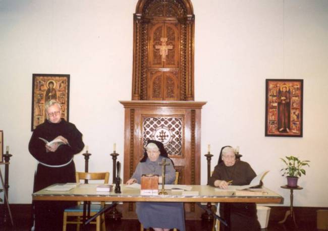
The first picture is straight, no adjustments. The second one I wanted to lighten the face to show up against the picture. I used the free hand tool, outlined just the face, and adjusted the brightness and contrast.
This is the back-lit picture of the Thoth float, first, as is. The second one is the picture, brightness 56, contrast 65. Then I selected the sky, filled it with a light blue, and on another layer I selected the tree branches on the right, and filled it with the same blue, R218, G255, B255. I couldn't get the sky to react to color or anything. I guess because it was all white.
This picture was taken in a Korean shop, with poor lighting. First, I brightened the entire scene, brightness 35, contrast 32. Then I did a color balance layer: midtones, red -27, green 40, blue 31; shadow, red -28, green 22, blue 33. Finally I selected the head only, did brightness 20, contrast 6. I used the eraser on some of the highlights in the foreground. |


